Photo by Patrick on Flickr.
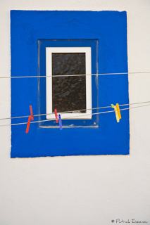
The colors are great, but what I really like about this image is the repetition of the frame within the frame within the frame. This also a great example of the use of negative space to make the heart of the image even stronger.
The colors are great, but what I really like about this image is the repetition of the frame within the frame within the frame. This also a great example of the use of negative space to make the heart of the image even stronger.
